Shanti Chemical Industries
Industry: Chemical Manufacturing • Timeline: 2 Weeks • Tech: HTML, CSS, JS, TypeScript
Project Overview
An elite, B2B ecosystem engineered to position Shanti Chemical as a global leader in high-performance dyes and industrial pigments.
Challenges
Industrial Stigma: Traditional chemical industry websites are often outdated and visually cluttered, making it difficult for modern brands to project innovation and reliability.
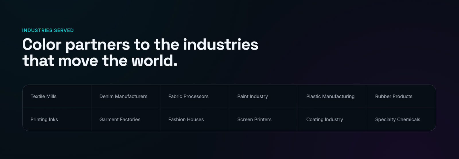
Information Density: The client manages an extensive catalog of reactive dyes and pigments. The challenge was to present these high-volume categories without overwhelming the user or sacrificing the site's minimalist aesthetic.
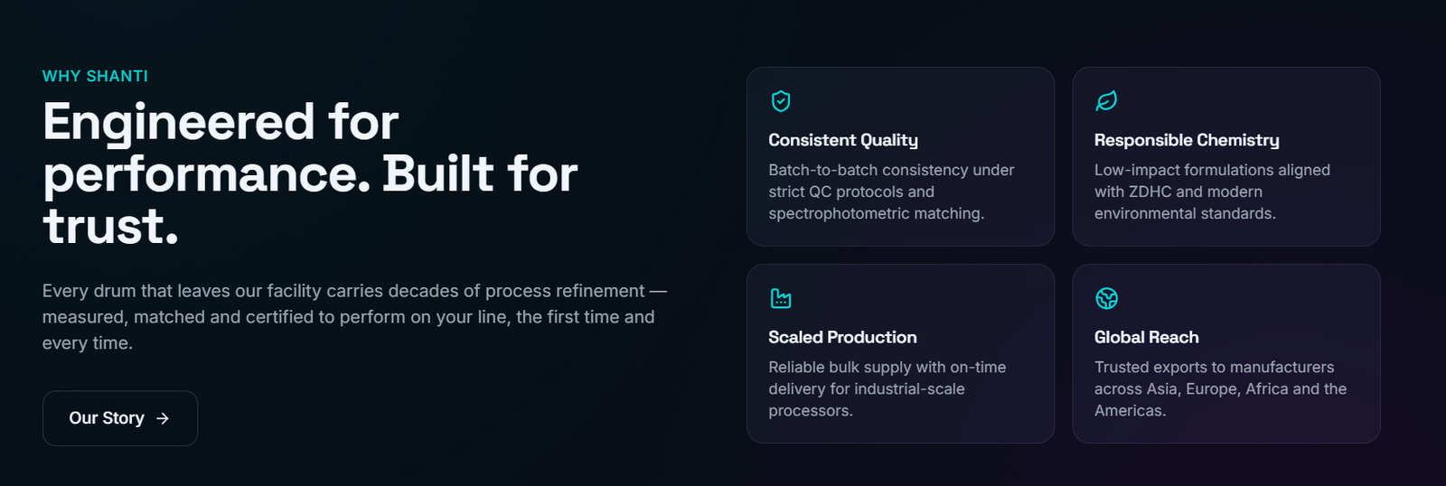
B2B Trust Building: In the chemical sector, trust is a primary currency. The design needed to move beyond a simple gallery and establish a "Command Center" feel that suggests precision, safety, and global scale.
Conversion Friction: Transitioning a user from a technical product specification to a sales inquiry often results in high drop-off rates in industrial B2B portals.
Information Density: The client manages an extensive catalog of reactive dyes and pigments. The challenge was to present these high-volume categories without overwhelming the user or sacrificing the site's minimalist aesthetic.
B2B Trust Building: In the chemical sector, trust is a primary currency. The design needed to move beyond a simple gallery and establish a "Command Center" feel that suggests precision, safety, and global scale.
Conversion Friction: Transitioning a user from a technical product specification to a sales inquiry often results in high drop-off rates in industrial B2B portals.
Our Solution
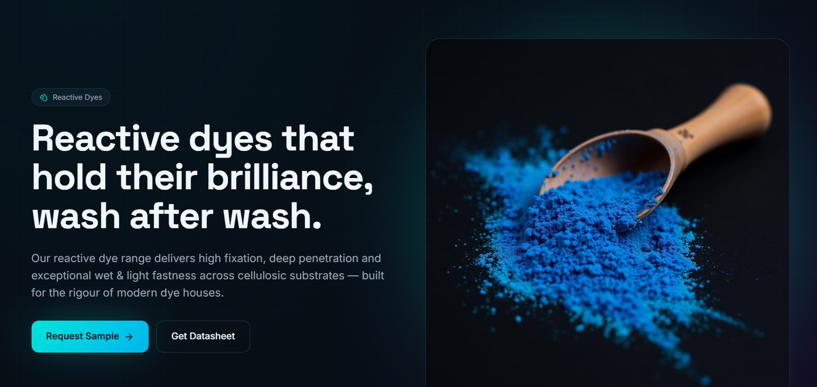
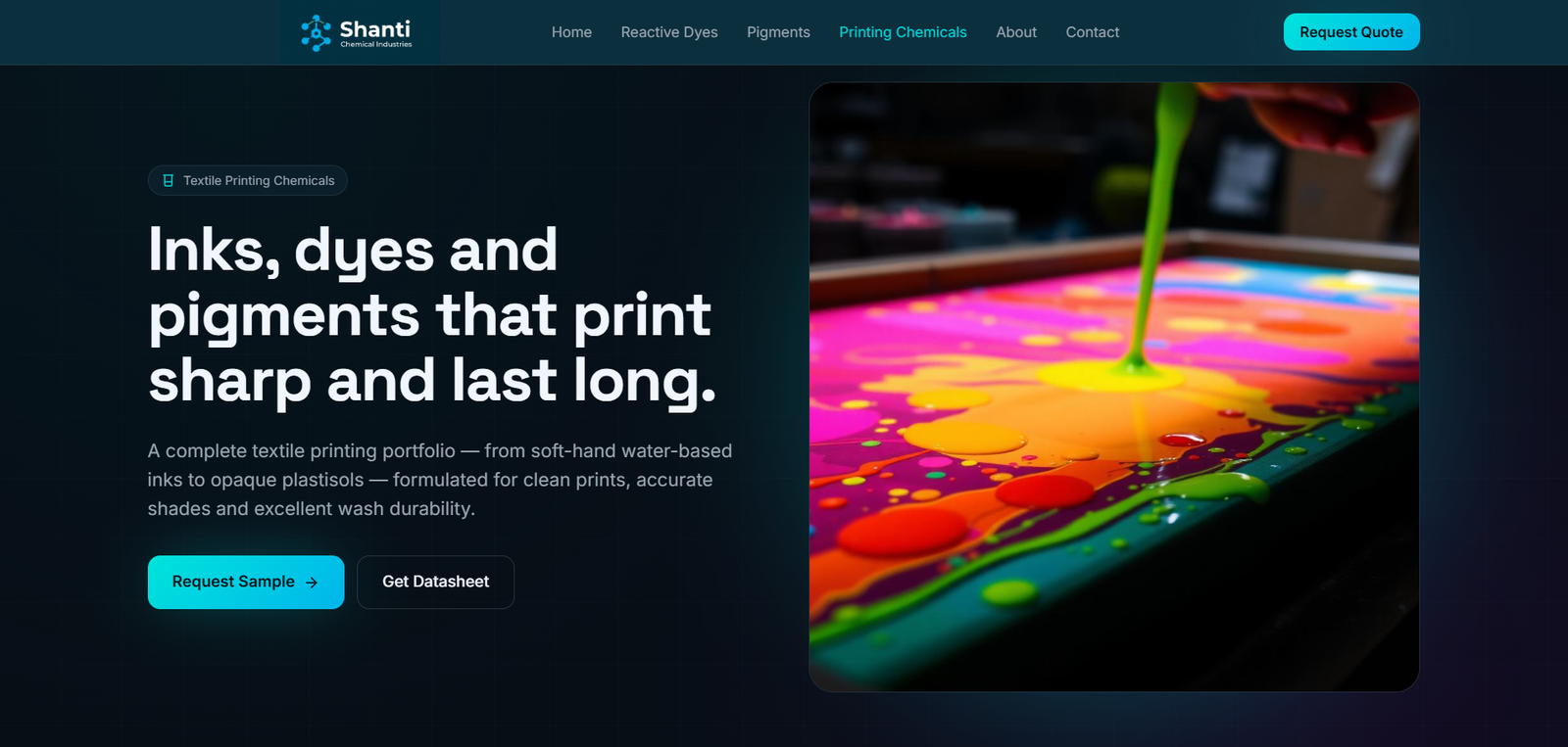
High-Contrast Action Design: We strategically deployed Sulfur Yellow (#EE9B00) across the interface. This creates a psychological "action trigger," guiding the user's eye toward sample requests and inquiry forms, thereby optimizing the lead generation funnel.
Responsive Information Architecture: The entire platform was built with a mobile-first philosophy, ensuring that industrial clients can access technical data and place inquiries from any device, whether in the office or on the manufacturing floor.
Clean-Room UX: We stripped away unnecessary elements to focus on the products themselves, using glassmorphism and subtle scroll animations (Framer Motion) to provide a premium, interactive experience that mirrors the precision of the chemical manufacturing process.`
Responsive Information Architecture: The entire platform was built with a mobile-first philosophy, ensuring that industrial clients can access technical data and place inquiries from any device, whether in the office or on the manufacturing floor.
Clean-Room UX: We stripped away unnecessary elements to focus on the products themselves, using glassmorphism and subtle scroll animations (Framer Motion) to provide a premium, interactive experience that mirrors the precision of the chemical manufacturing process.`
Results
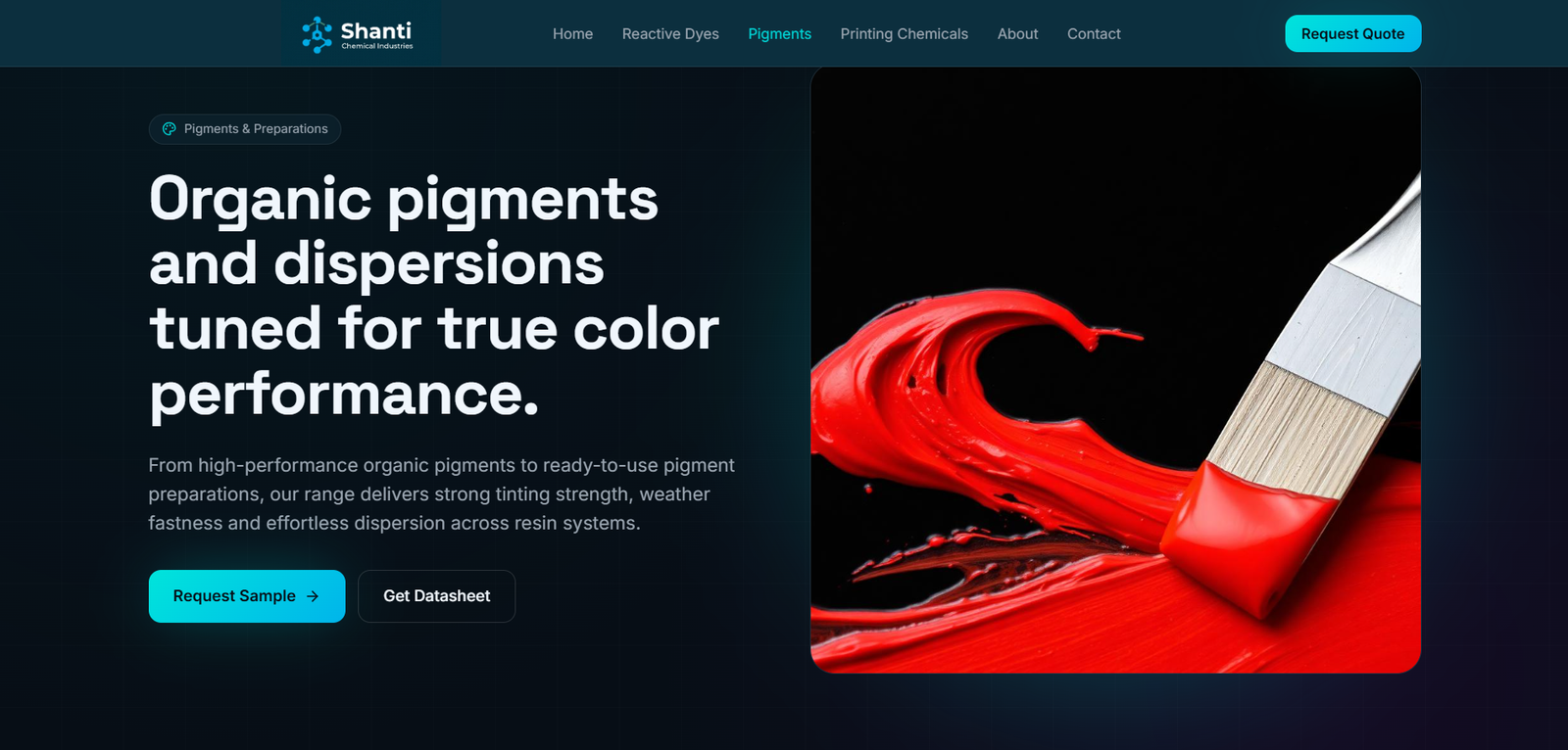
Tech-Forward Visual Identity: We implemented a "Precision Chemistry" theme using a dark mode architecture. This positions the brand as a cutting-edge innovator rather than a legacy manufacturer.
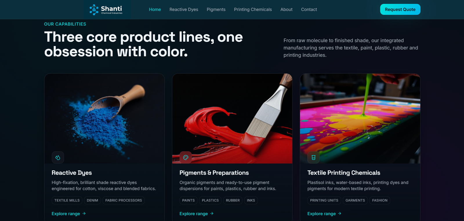
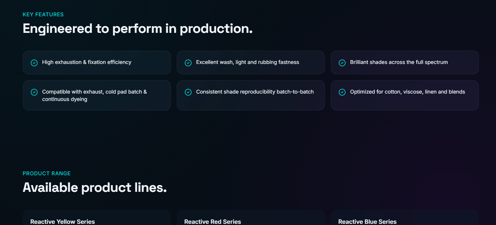
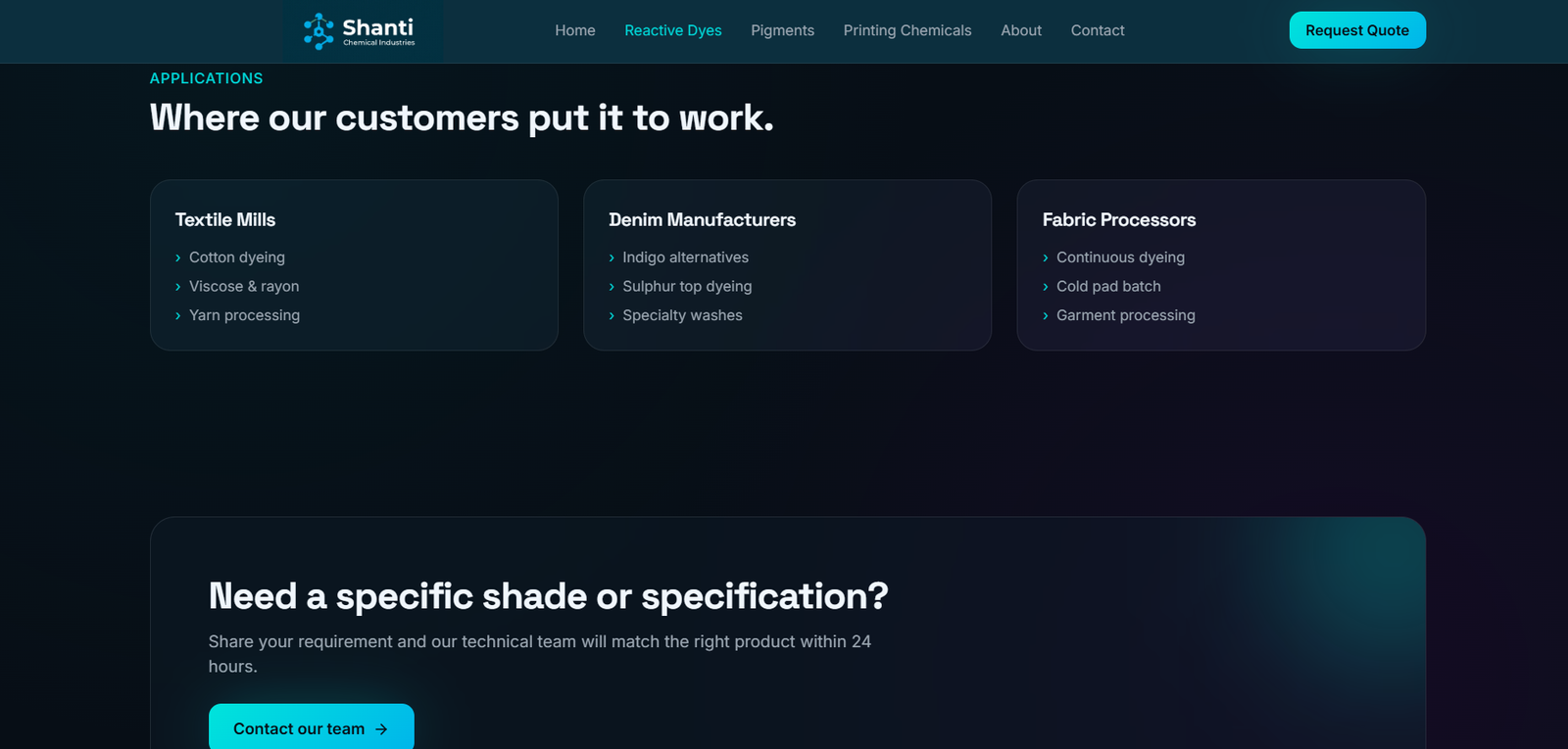
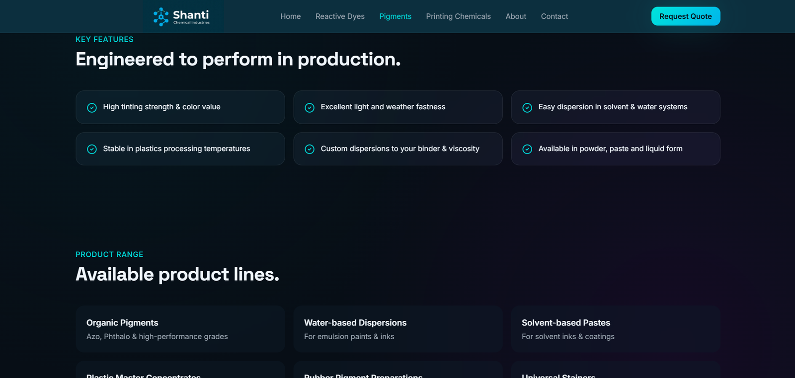
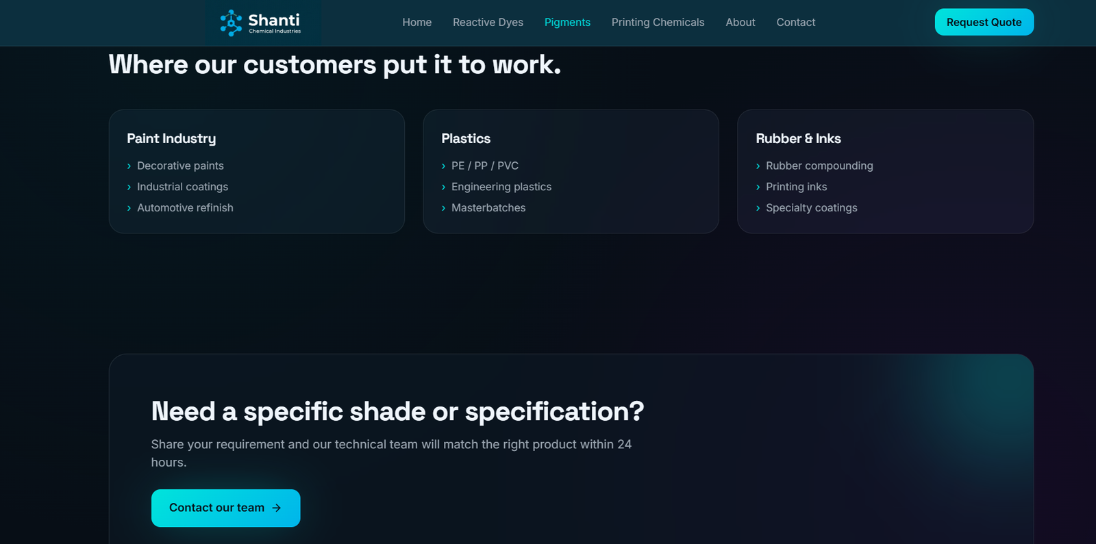
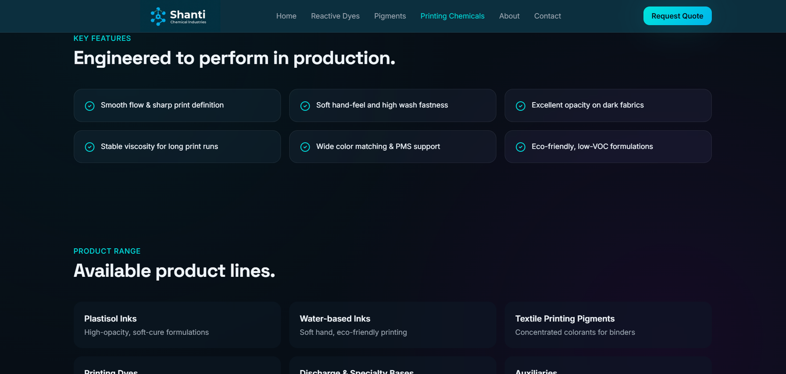
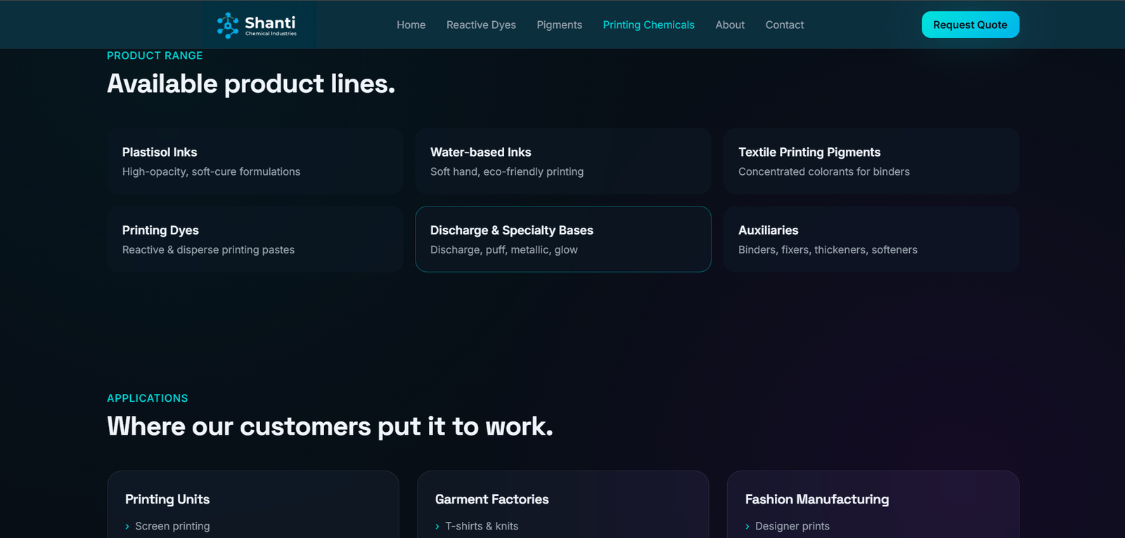
Strategic Categorization: By utilizing a modular component-based grid, we segmented the core offerings into distinct, high-impact sections. Each category (Dyes, Pigments, Chemicals) was given its own visual space, supported by custom iconography to aid rapid identification.
Strategic Categorization: By utilizing a modular component-based grid, we segmented the core offerings into distinct, high-impact sections. Each category (Dyes, Pigments, Chemicals) was given its own visual space, supported by custom iconography to aid rapid identification.